Yesterday morning Matt Yglesias did a bit of data shitposting: he tweeted out a chart of gas prices over the past few weeks, showing a drop of about 2 cents per gallon, and captioned it “Gas prices steadily falling since Biden signed the infrastructure bill and fixed inflation.”
This is a pretty decent tongue-in-cheek parody of shitty punditry: the chart sucks because it only has three weekly datapoints, which is funny, the actual price drop is miniscule, also funny, and the wording attributes God-like powers to the president to magically set gas prices, which is something lazy commentators do all the time.
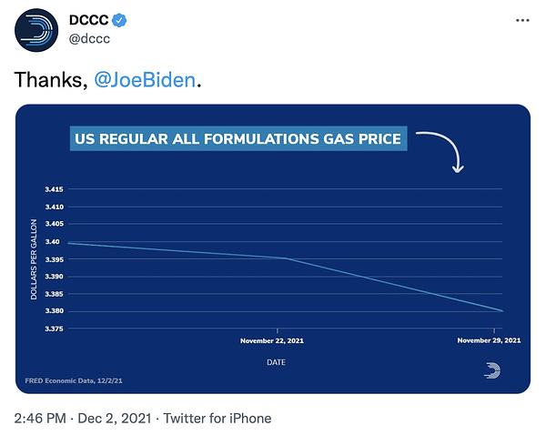
The six or seven people on the internet who into this sort of thing had a good laugh and then everyone went on about their day. Everyone, that is, except for the Democratic Congressional Campaign Committee (DCCC), which apparently didn’t get the joke and blasted out a painfully earnest version of the exact same chart six hours later.
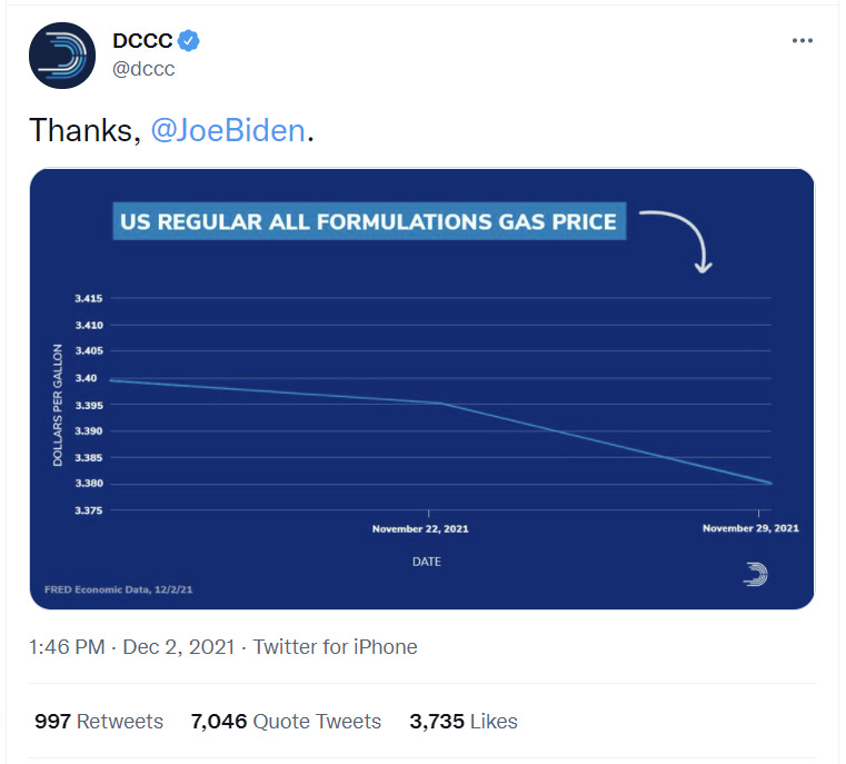
“Thanks, @JoeBiden,” the DCCC writes, captioning a chart that — again — shows a drop in gas prices of 2 cents, or a little more than one half of one percent.
Given this, it’s probably worth unpacking exactly why this chart sucks so much, because it’s basically a vessel for a cascading series of design and conceptual problems that devour one another, Russian nesting doll-style.
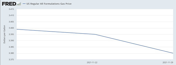
The first obvious problem is the Y-axis (heh). It starts at 3.375 dollars and goes up to 3.415, a spread of 4 cents which makes the 2-cent drop look huge. This is pretty misleading, especially in conjunction with what’s happening on the X-axis: there are only three dates plotted. Pro tip: if you only have three data points, you probably shouldn’t be making a chart.
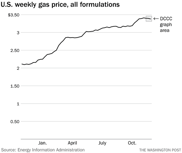
The truncated X-axis is reason this chart looks so stupid: all you get is a two-segment line, rather than a nice long series of data points that tell some sort of story. When you extend the X-axis back to a more reasonable date, like January 1st, that story actually emerges: gas prices are waaaay up in 2021! The Washington Post’s Philip Bump, who I am loathe to complement for any reason, competently does that here:


The other little bit of WTF in the DCCC chart is the decision to report the gas prices out to three decimal places. We don’t typically conceive of prices this way, which makes the Y-axis surprisingly difficult to parse. Try saying $3.375 out loud, for instance — how the hell would you even do it? “Three dollars and 37 and a half cents,” I guess, which is madness — it’s basically asking you to add fractions of cents to fractions of dollars, which gets very confusing.
But all of this — the axes, the miniscule drop in actual prices, the paltry number of datapoints — all of it takes a backseat to a much more fundamental problem with what this chart is being asked to do: Presidents don’t set gas prices. So the idea that a gas price chart can be a messaging win for a president is critically flawed from the get-go.
I typically think of charts and other visuals as arguments: what point is this chart trying to make? What is this map trying to make me conclude? And arguments can be good and compelling or they can be beside the point. This chart is very clearly the latter.
Another thing I notice is that people tend to spend a lot of time obsessing over the nuts-and-bolts of chart design: are these axes sensible? Are the colors okay? Is it the right type of my chart for the data? But a lot of times a chart is undone not by a design decision, but by a fundamental conceptual flaw: the (lack of) link between gas prices and presidential policies, for instance. A correlation that doesn’t imply causation, or even just plain old faulty data.
The DCCC chart is a real treat because it manages to fail at both the nuts-and-bolts design stuff as well as the bigger conceptual issues. And for that reason it makes for a wonderful lesson in how not to visualize data.
Enjoy your weekend!


Well done, Chris. Your math teacher is proud!
"This is a pretty decent tongue-in-cheek parody of shitty punditry."
If only! Actually, Matt Yglesias keeps committing obvious data presentation sins and getting called for them by myself and other commentators. And since Mr. Y certainly knows enough to choose the right scale and origin for his Y-axis, one can only conclude that he's trying to get away with something.
BTW: There is no "e" in the word "loath." Just sayin'...