Map: Where America's air is the dirtiest
In some places, annual average pollutant levels surpass WHO limits for single-day exposure.
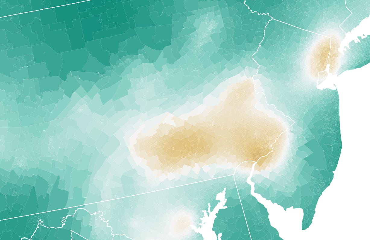
We’re talking about dirty air this month at The Why Axis. One of the first things we need to do is to get the literal lay of the land, in order to answer a really basic question: which places in the U.S. have the dirtiest air?
For simplicity’s sake, we’re going to answer this by measuring average annual fine particle pollution, or what’s known as PM2.5. This stuff is of particular (get it?) concern to regulators because its small enough to get inhaled deep into the lungs, where it can enter the blood stream and even the brain. All manner of health problems ensue.
Average annual levels of PM2.5 form the basis of a number of environmental regulations and guidelines. The EPA, for instance, says that annual levels of this pollutant shouldn’t surpass 12 micrograms per cubic meter (µg/m³). The World Health Organization recently slashed its limit down to 5 µg/m³, a nod to all the new research showing that this stuff is a lot worse for us than previously expected. The WHO further says that nobody should be exposed to levels of PM2.5 higher than 15 µg/m³ for more than 24 hours.
So, here’s the bad news: there are still places in the U.S. where average PM2.5 levels surpass that 24-hour 15 µg/m³ limit all year round.
Not a lot, thankfully. But those places do exist. Take a look at the map below: it shows data from 2018 at the Census tract-level. The underlying numbers come from the EPA, and are derived from a network of thousands of air quality monitors, with some statistical modeling to fill in the gaps in the data.
I’ve shaded this so that green represents the bottom (e.g., less-polluted) half of the Census tract distribution, while areas in brown have dirtier air. In 2018, the air was relatively bad in places like east Texas and many of the states near the Gulf of Mexico. There’s another big splotch of dirty air covering Illinois, Indiana and Ohio. Certain eastern seaboard cities also have little halos of brown around them.
But the worst air, by far, was in California’s Central Valley. Unique geography — the valley’s surrounded by mountains on all sides — coupled with concentrated agricultural activity, oil refining and heavy vehicle use have made the Central Valley a notorious hot spot for poor air quality year after year.
There was also an area of extremely heavy pollution running from eastern Washington through western Montana in 2018 — I believe this was due to wildfire smoke.
Now I’m going to show you a different version of the map. It’s the exact same underlying data, but colored using discrete buckets pegged to regulatory thresholds.
Here, areas of the country with PM2.5 levels below the WHO’s 5 µg/m³ limit are shaded green. As you can see, these are basically rural places where very few people actually live. Tracts with annual PM2.5 averages not exceeding 50 percent above the WHO guideline are in light grey, while places with levels between 50 and 100 percent higher than the WHO standard are light tan.
People living in regions of the country in medium and dark tan are exposed to annual levels of PM2.5 more than twice as high as the WHO-recommended amount. It’s not an exaggeration to say that the air is putting their health at risk, and likely shaving literal years off their life expectancy.
Its frustrating that this big-picture data currently only goes through 2018. As I understand it, it takes a lot of work for the EPA to compile hourly data from thousands of individual monitoring stations, validate that data to weed out errors and outliers, average the numbers on an annual basis, and feed it all into the models used to fill in the gaps between monitors.
It’s a lot more complicated than simply putting together a dot map of whatever reading the monitors are showing right now. The EPA does this too, by the way — their AirNow website is a great place to find out what the air is like in your neighborhood today.
Still, given that the research on dirty air is evolving rapidly, and that the findings are almost always pointing in the exact same direction and showing effects that are very, very bad, it would be nice if we could shorten the lag time on the annual summary data by oh, I dunno, a couple years maybe? If that requires throwing more money at the EPA or updating the way they compile this data then so be it. The returns on any such investment are likely to be enormous.
The data shows what my head, sinuses and lungs already knew. Central IN is one big brown splotch. Given that the state is a far-right Repub stronghold (some might use the word ‘rabid’) I don’t expect anything to be done about this anytime soon. Thanks for the reporting on such an important issue.
Really surprised at the results in California! (Even though the explanation does make sense re: the Central Valley geography). I know it’s partially natural factors (and perhaps just population density per se) but I’m disappointed that these green and progressive parts of the continent show such dirty air.