
How the Senate's legislative graveyard benefits the rich


We’re gonna start today with a chart most of you have probably seen before: it’s the share of national income going to the top 1 percent of earners, since 1913. It’s a measure of inequality that became widely known after the publication of economist Thomas Piketty’s influential Capital in the 21st Century.
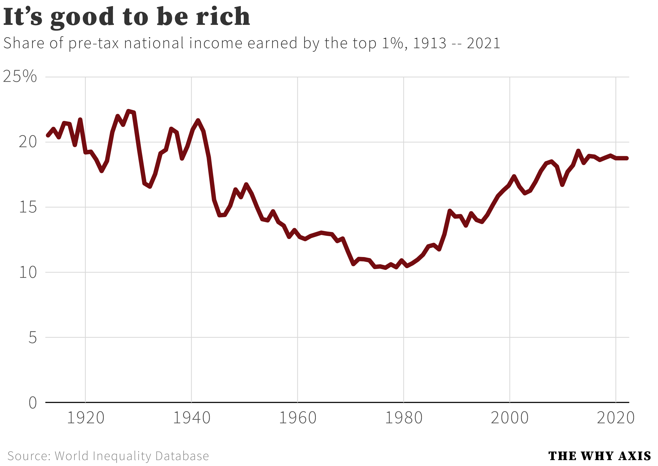
As you can see, at the tail end of the Gilded Age the richest 1 percent of Americans were raking in well over 20 percent of national income. It stayed at that level for several decades, only dropping meaningfully following World War 2. Not coincidentally the post-war era also saw the imposition of the steepest tax rates on the rich, surpassing 90 percent at the very top of the spectrum.
As the share of income going to the 1 percent fell, it rose for the working class: in the three decades between 1940 and 1970, the top 1 percent share fell from 21 to 11 percent, while the bottom half of earners saw their share rise from 14 to 20 percent. But starting around 1980 those trends reversed: 1 percenters saw their slice of the pie grow to nearly 20 percent by the mid-2000s, while the bottom half’s share fell back down to 14 percent.
It’s a well-known story by this point, and one lamented by progressive economists and policymakers. At the dawn of the 21st century we’re on the cusp of a new Gilded Age, where billionaires buy themselves joyrides to the edge of space while millions of Americans starve, go homeless, and get saddled with obscene amounts of medical debt.
Now, we’re going to consider that inequality trend in light of a chart that you probably haven’t seen before: an index of gridlock in Congress, measured using the total volume of national legislative policymaking, weighted for importance. Check it out: